BAM Construction / 110 Queen Street / 2010
Capturing Glasgow’s character through a place-led property identity
Overview
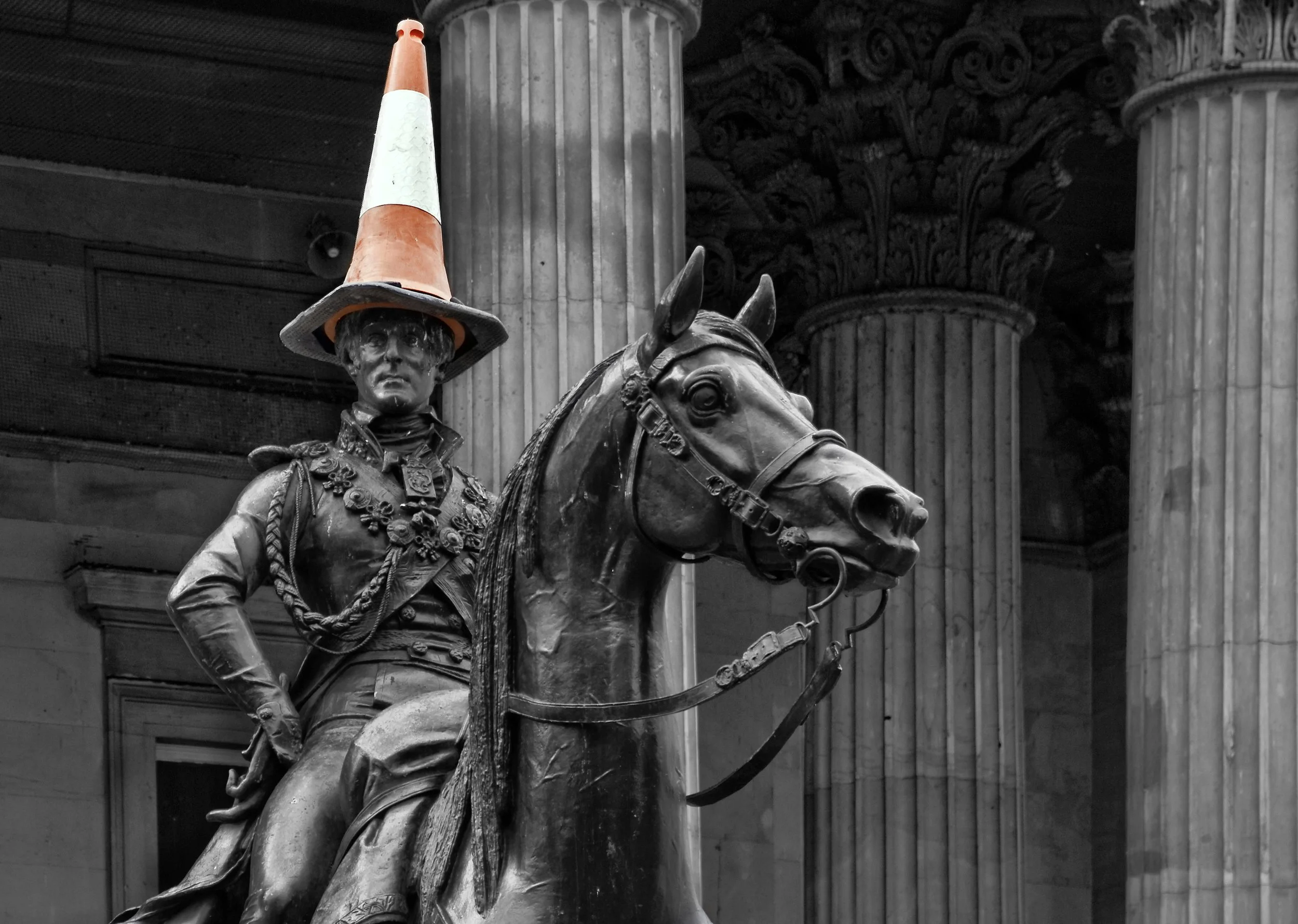
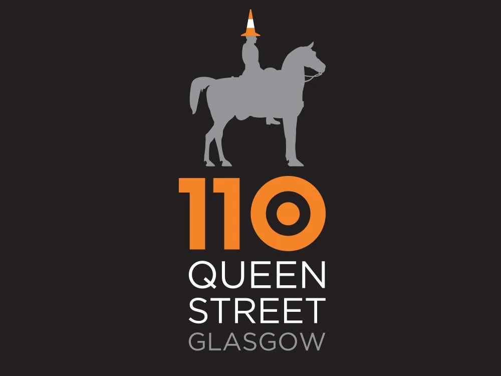
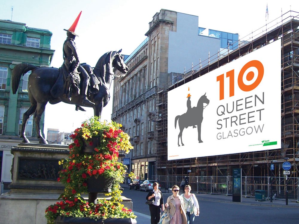
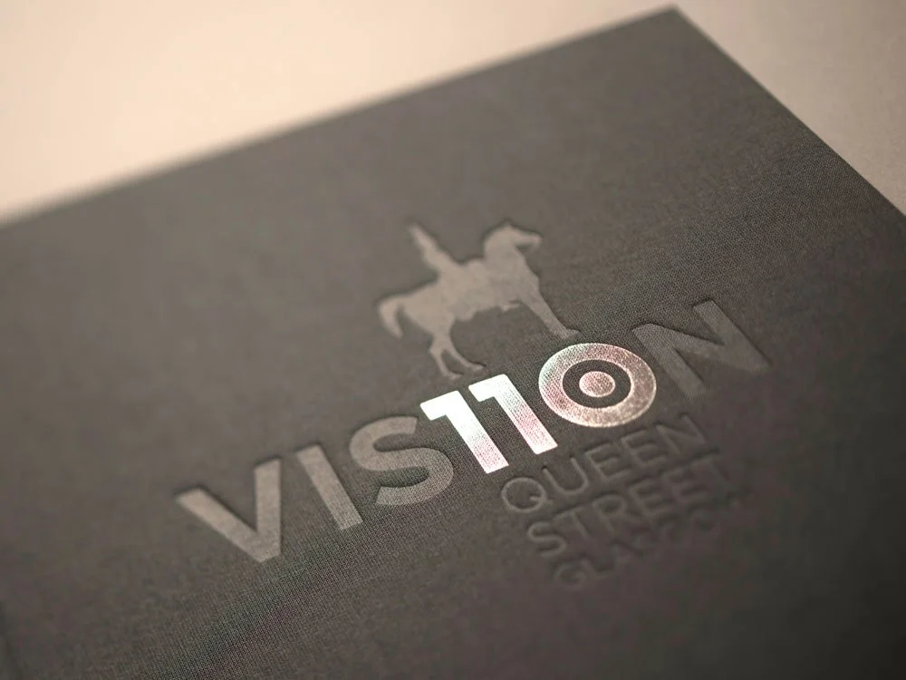
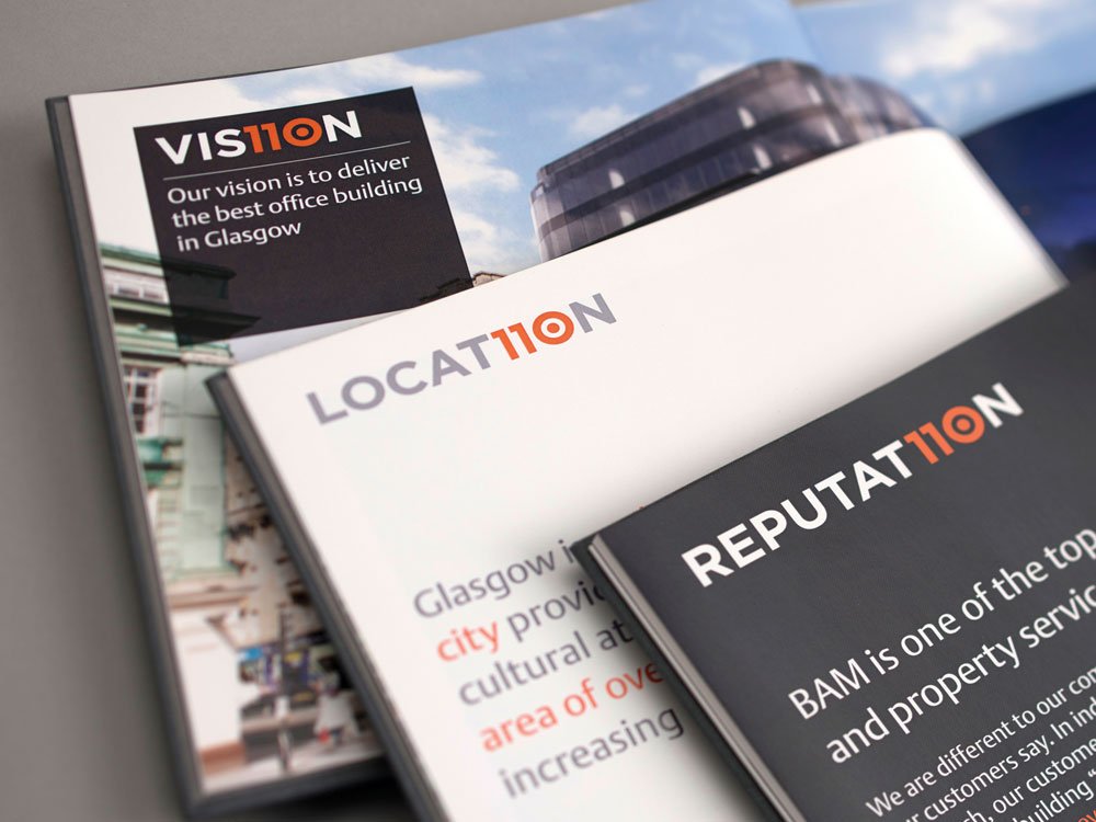
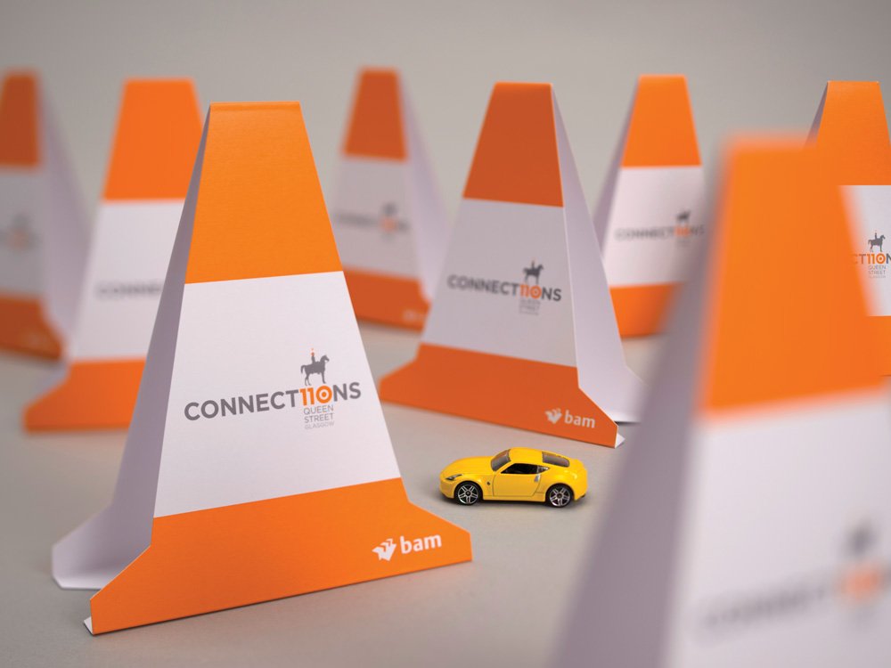
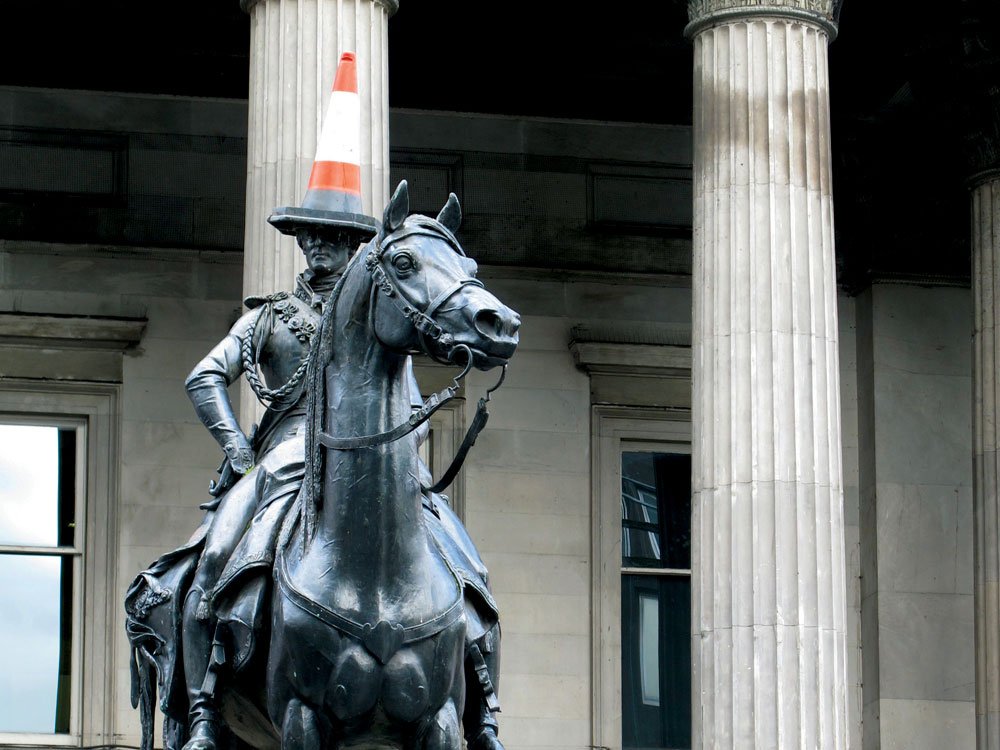
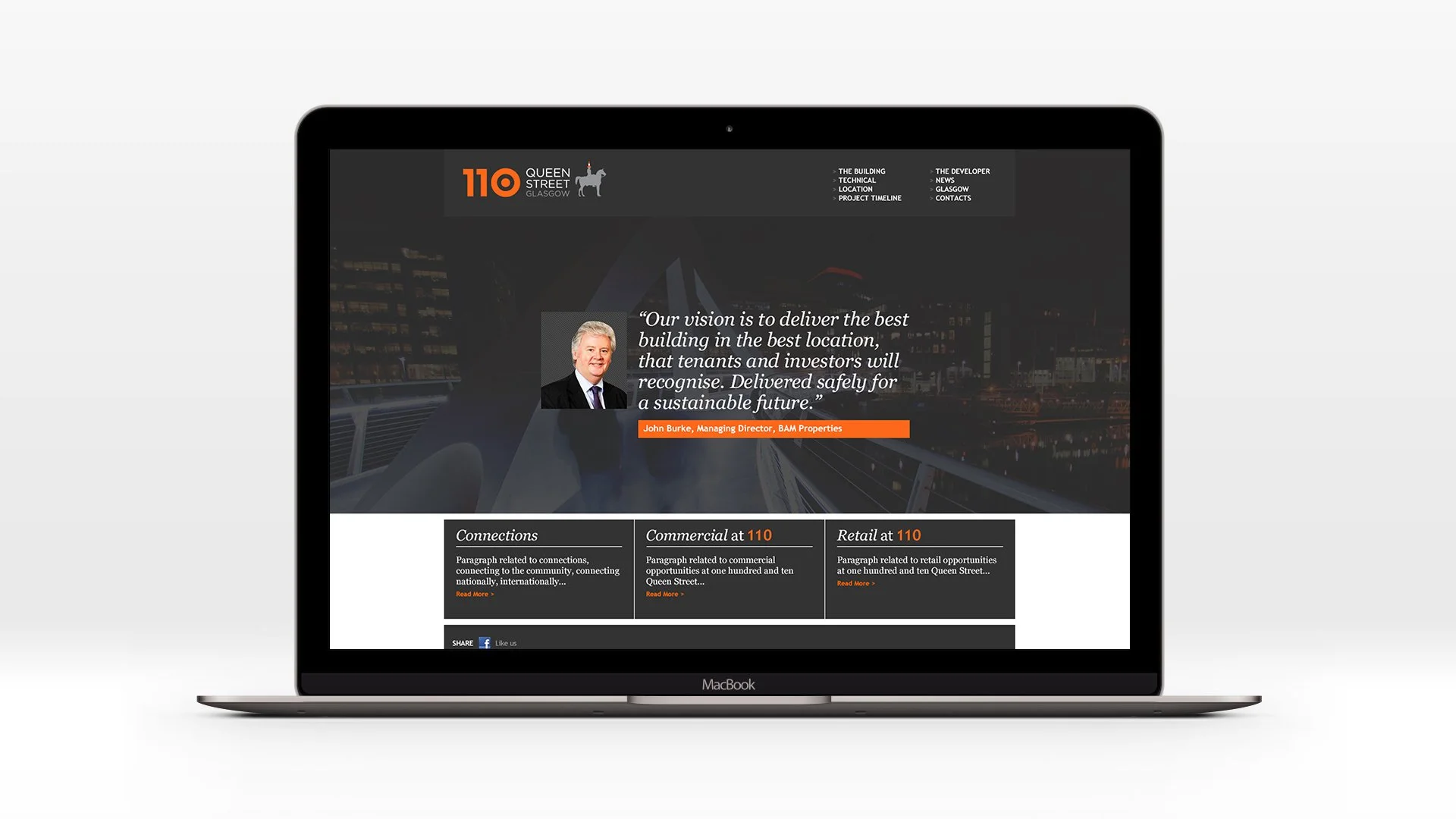
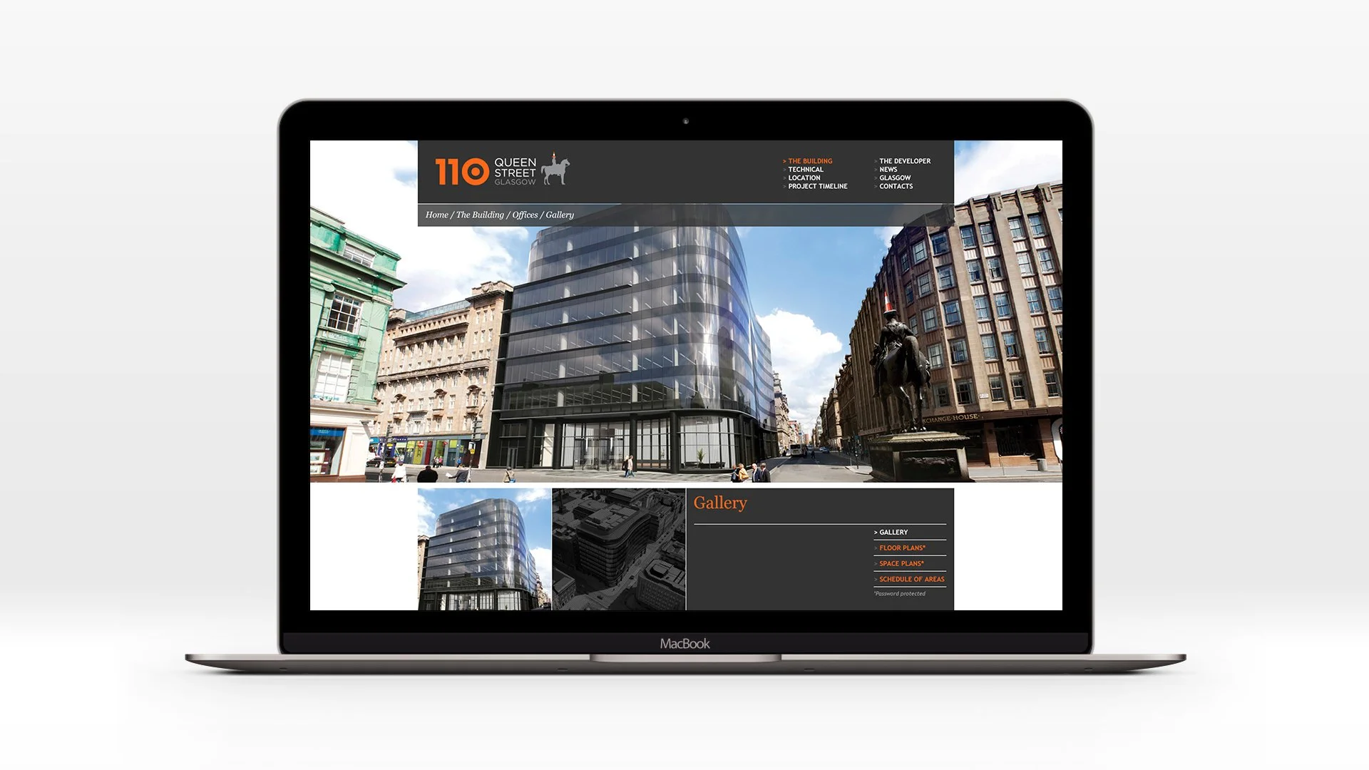
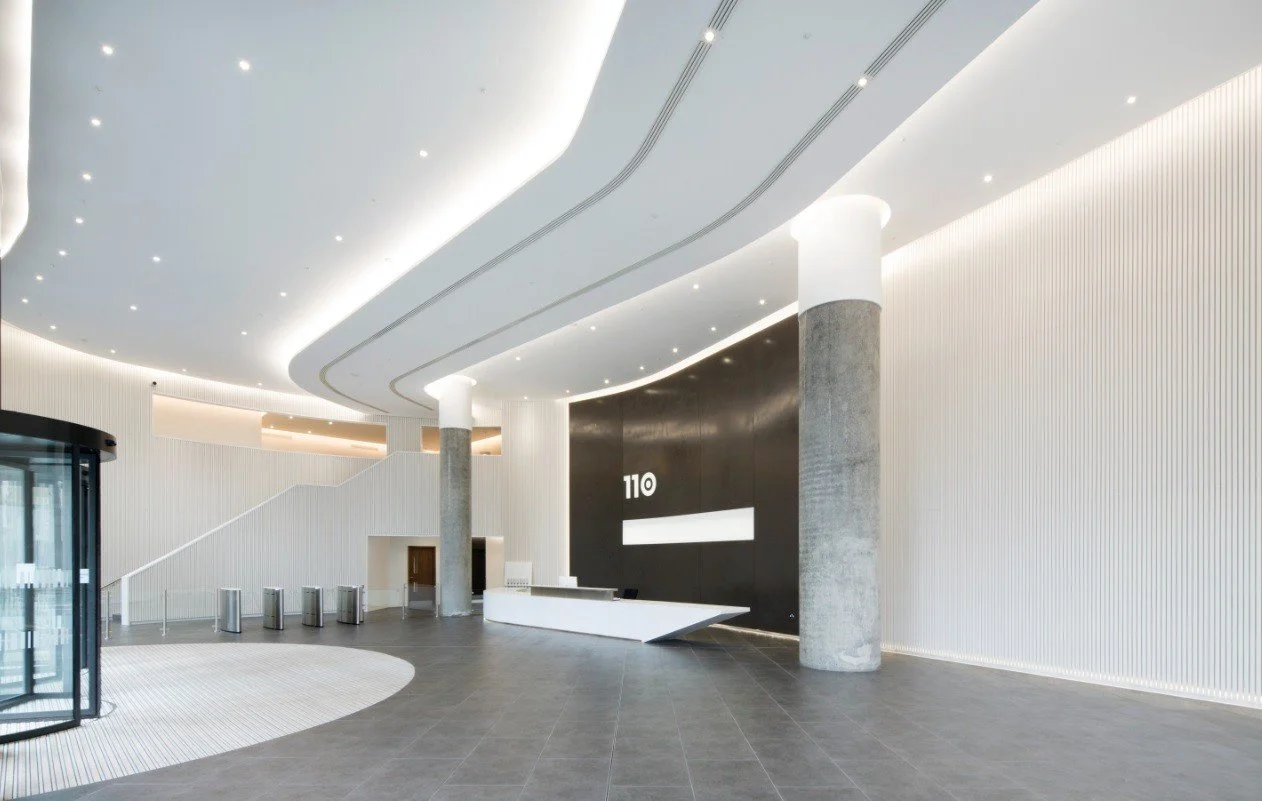
BAM Properties’ 110 Queen Street development in Glasgow required a distinctive identity that would resonate locally while maintaining a contemporary, premium tone. Drawing inspiration from the nearby Duke of Wellington statue, famously topped with an orange traffic cone, the concept embraced the city’s irreverent humour and cultural character. The address number 110 became a core device, replacing “io” in key words such as vis110n and locat110n, creating a bold and memorable typographic identity rooted in place.
My role
I developed the overarching concept and visual identity, translating the local reference and the “110” typographic device into a cohesive brand system spanning a logo, typography, colour palette and marketing collateral. In the logomark, the zero in 110 was designed as a top-down view of a traffic cone, reinforcing the concept in a subtle but distinctive way. The identity balanced wit with professionalism, ensuring the development felt culturally connected while remaining commercially credible within a competitive property market.
£50 million project
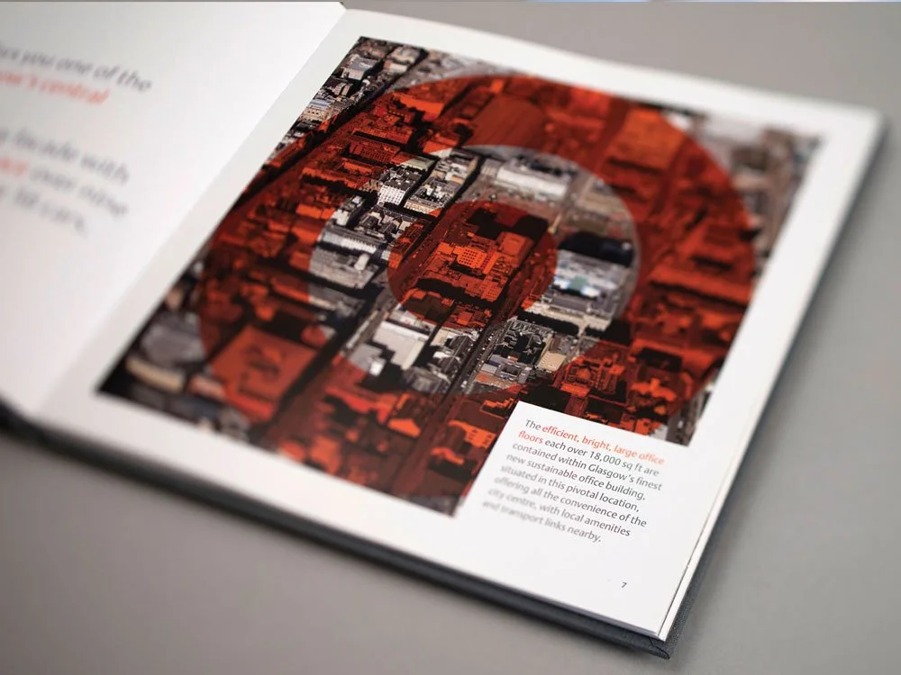
143,000 sq ft of prime office space
7 tenants
£50 million project 143,000 sq ft of prime office space 7 tenants
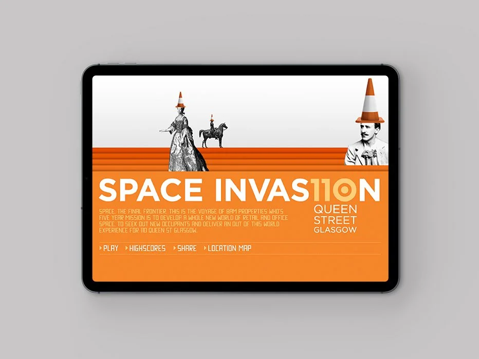
A fun interactive game on the project page
The final fitout
Feeling inspired?
-
![]()
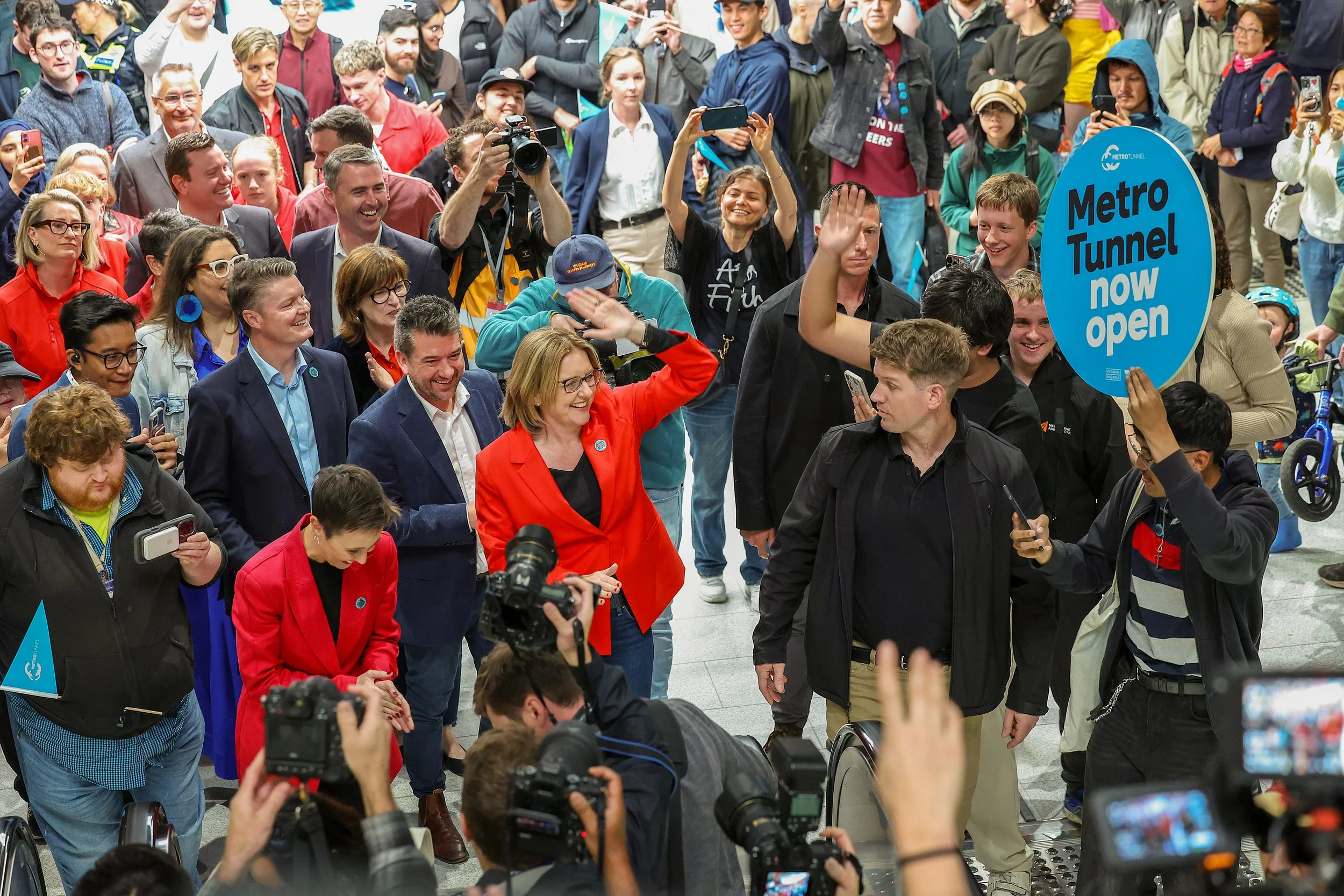
Opening Day
Metro Tunnel / 2025
Generating city- and state-wide excitement to launch a $15bn transport project -
![A person in a blue shirt is placing a transit pass into a blue ticket machine at a station.]()
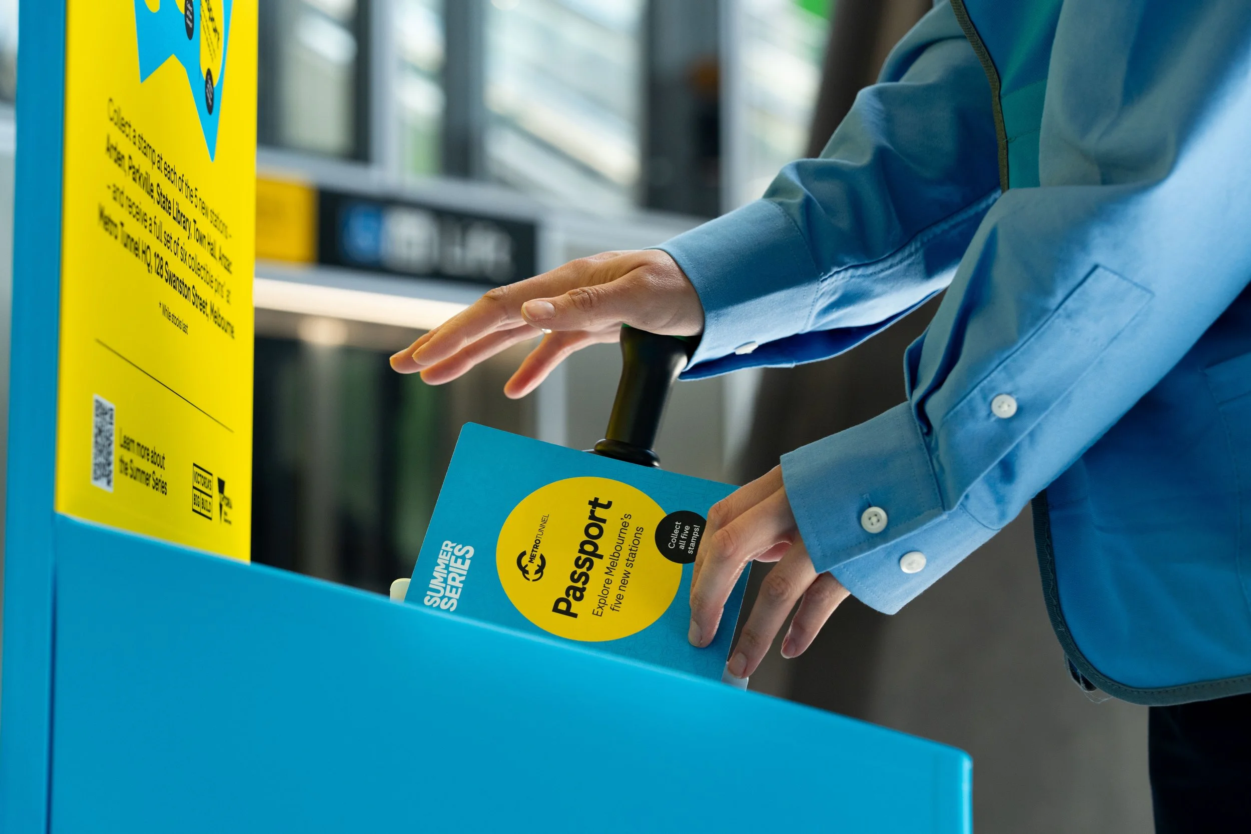
Passport Challenge
Metro Tunnel / 2026
Activating the Metro Tunnel ahead of major service change through a high-demand summer campaign -
![Three smartphones displaying different parts of a mobile app for a summer series scavenger hunt and collectibles. The screens show bright colors, icons, and instructions for finding collectibles near metro stations and tracking progress.]()
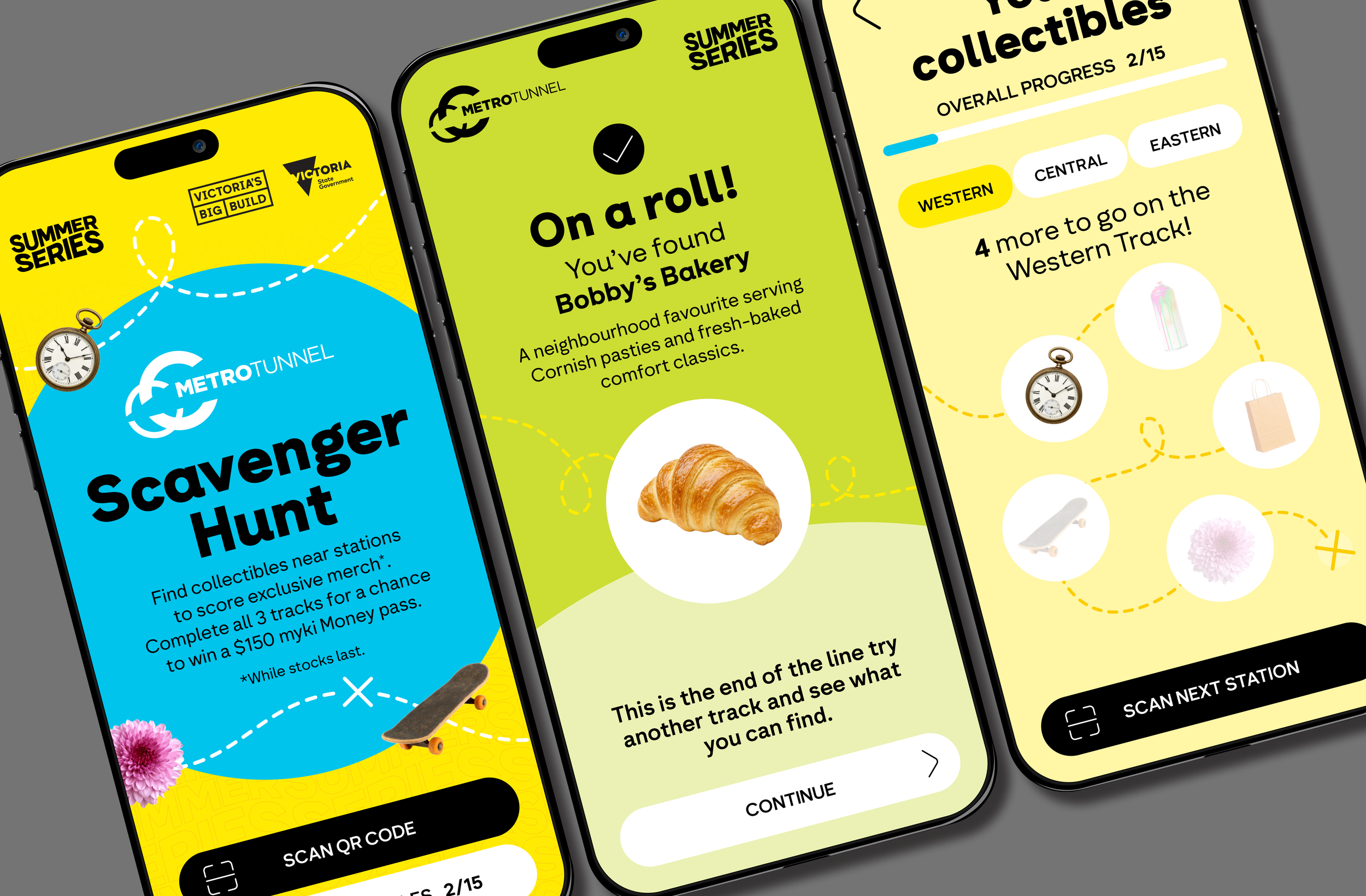
Scavenger Hunt
Metro Tunnel / 2025
Driving exploration and connection through a game-based, city-wide transport challenge -
![Colorful map of Seattle with stylized circular sections depicting streets and neighborhoods, including landmarks such as Parkville Station, Alder Station, Town Hall Station, and State Library Station, against a colorful, graphic background.]()
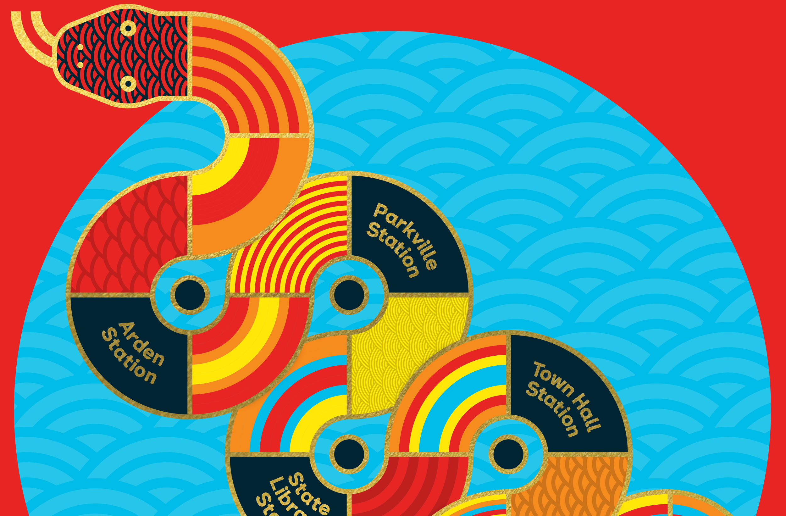
Lunar New Year Festival
Metro Tunnel / 2025
Helping communities learn about the project through culturally led design -
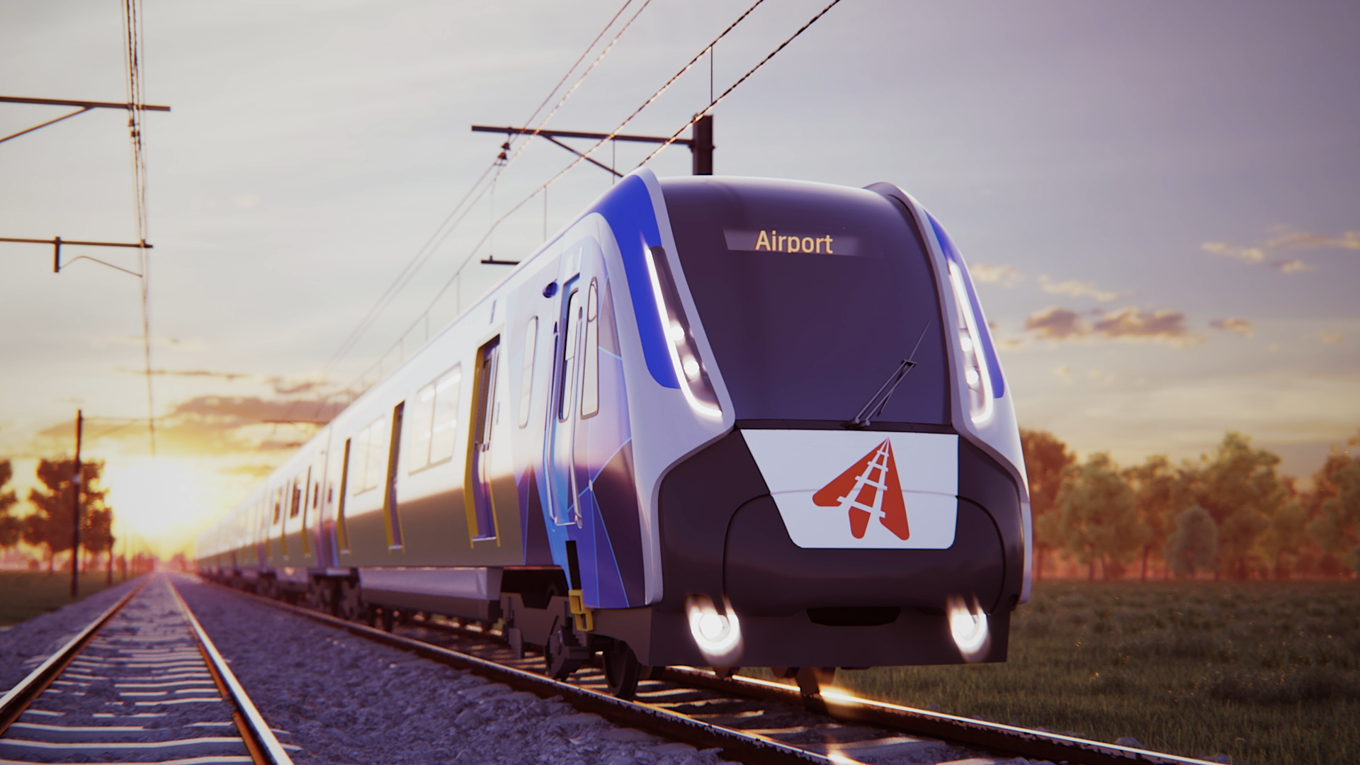
![A modern blue and white train with a digital display reading 'Airport' on the front, traveling on railway tracks during sunset with a background of trees and a partly cloudy sky.]()
Branding & Identity
Melbourne Airport Rail / 2019
Defining the identity of a project Melbourne has waited decades for -
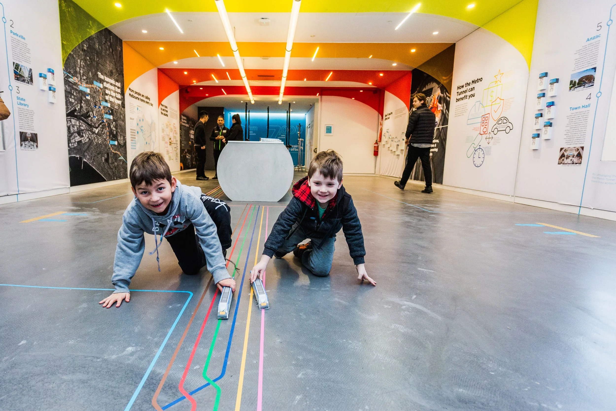
![Two young boys crawling on a museum floor with colorful lines, playing with train toy sets, with other visitors and informational displays on the walls in the background.]()
Brand & Experiential
Metro Tunnel HQ / 2018
Bringing Victoria’s largest transport project to life for the public -
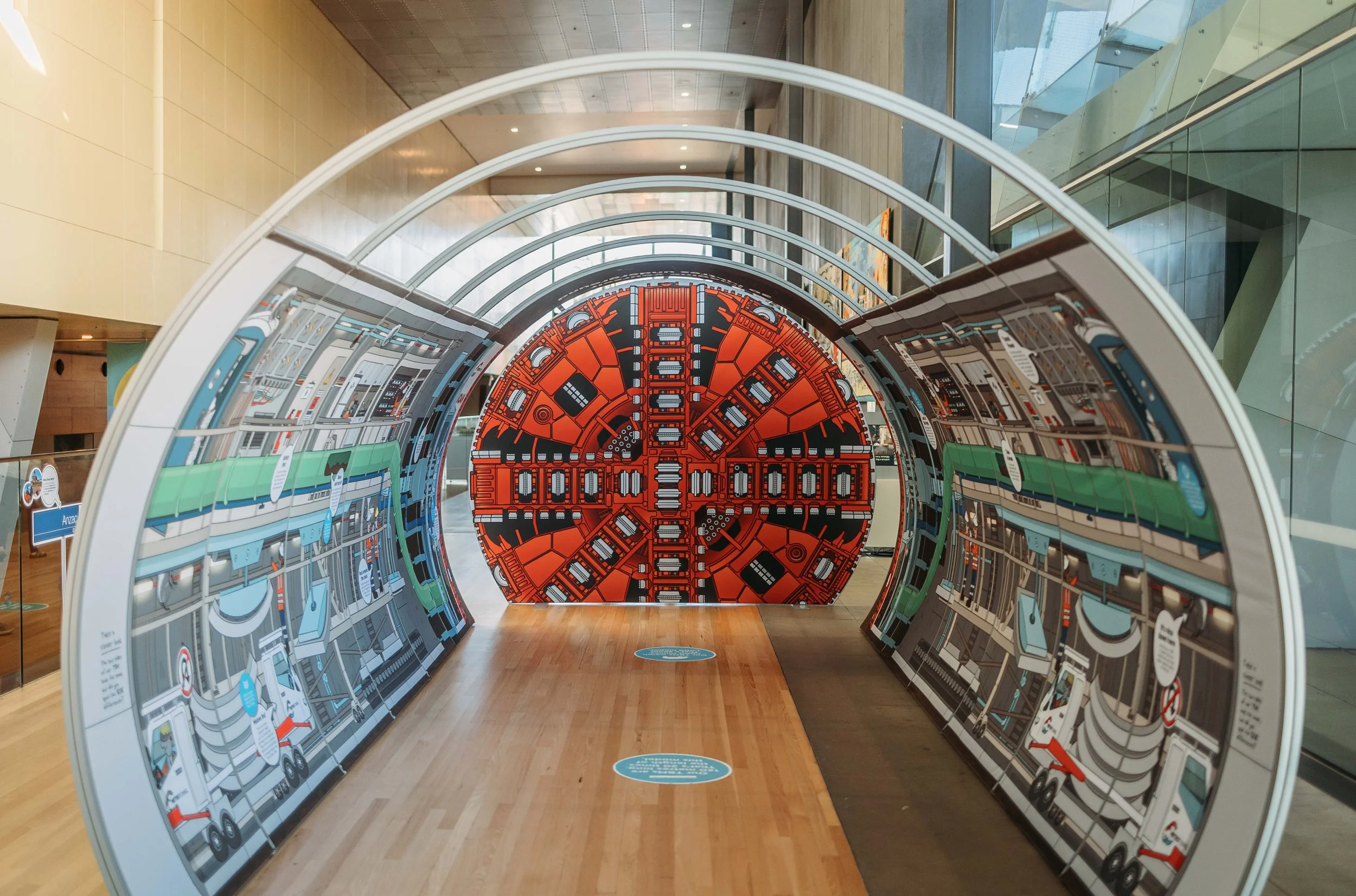
![Interactive exhibit with a circular, circuit board-like display inside a modern building with glass walls and wooden flooring.]()
Melbourne Museum Activation
Metro Tunnel / 2021
Illustrating big infrastructure to inspire curious little learners -
![]()
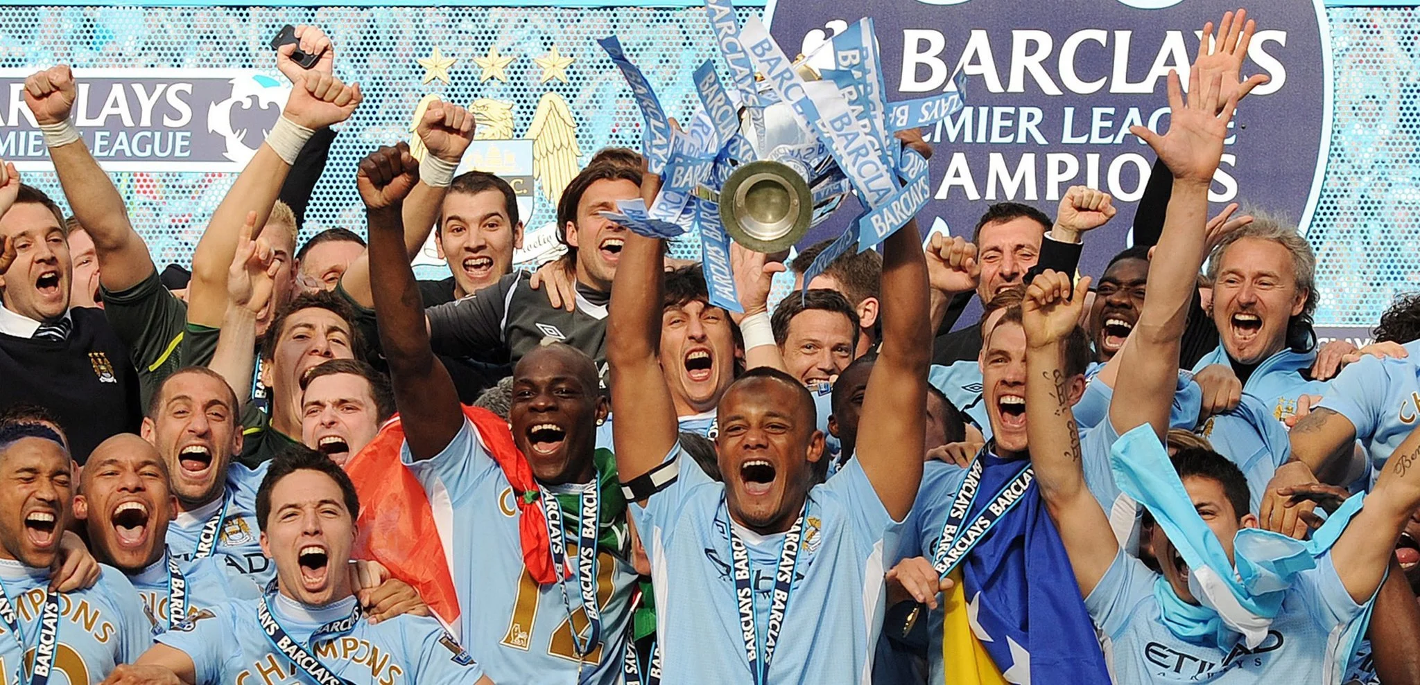
Season Review
Premier League / 2012
Visualising the drama of a landmark Premier League season -
![]()
Annual Report
WPP / 2012
Translating global strategy into a bold, culturally inspired annual report